Visual Identity Guidelines
Welcome to the Visual Identity Guidelines for Renex Exploration Company. (“RENEX®”). This document provides standards for the consistent use of RENEX®’s brand assets, ensuring our brand is represented cohesively across all materials.
Logo Usage
Primary Logo
The RENEX® logo is the cornerstone of our brand identity and should be displayed prominently in all applications. Use the primary logo on white or light-colored backgrounds to ensure optimal visibility.
- Minimum Size: The logo should never appear smaller than 1.5 inches in width for print or 148 pixels for digital applications.
- Clear Space: Maintain clear space around the logo equal to the height of the letter "R" in "RENEX®" to avoid crowding.
Alternate Logo Versions
For instances where the primary logo is unsuitable, such as on dark backgrounds, use the white or monochromatic versions of the logo.
Prohibited Logo Alterations
To maintain brand consistency, do not:
- Distort or stretch the logo.
- Alter the colors of the logo.
- Add effects such as shadows, gradients, or outlines.
- Rotate or tilt the logo.
- Place the logo on complex or patterned backgrounds.
Historical Logos
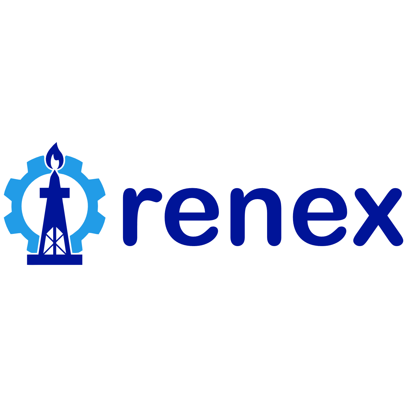
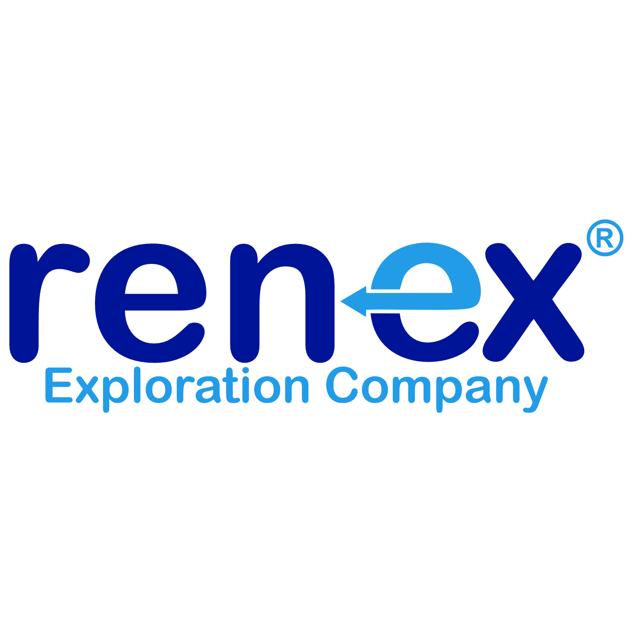
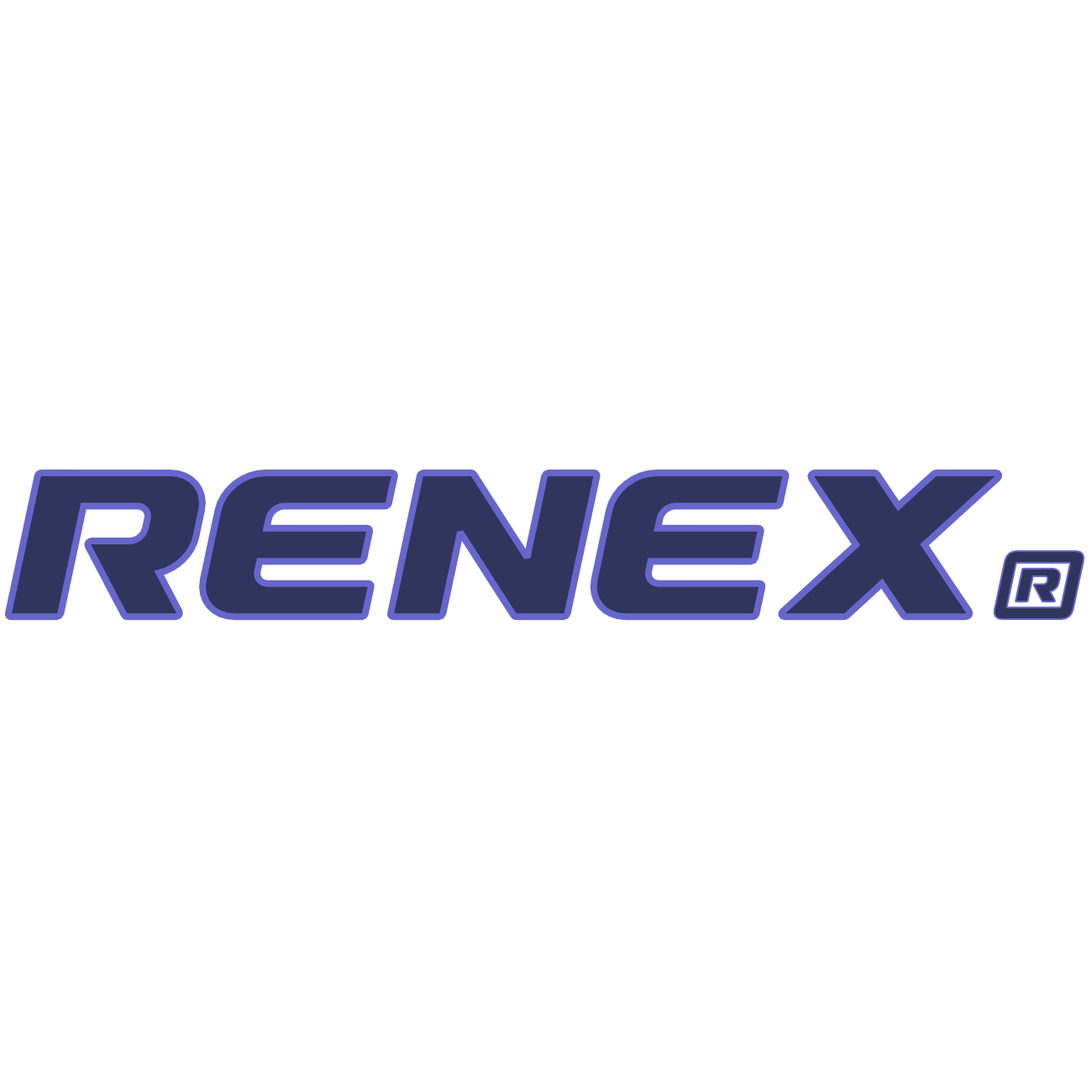
As RENEX® has evolved, so has its logo. Below, we display previous logos from our brand’s history. Each logo reflects a chapter in our journey and serves as a reminder of our legacy. While these logos should not be used in current applications, they represent the growth and transformation of the Renex brand over time.
Logo Timeline
| 1985 - 1994 |  | The original logo, symbolizing the early foundation of the company. |
|---|---|---|
| 1994 - 1999 |  | Updated to reflect the expanding operations and modernization efforts. |
| 1999 - 2016 |  | An evolution towards a more global, forward-thinking brand. |
| 2016 - |  | A sharp and refreshed design that aligns with our goals and innovation. |
These historical logos are available for internal reference and archival materials only. For all public-facing materials, please use the current logo as outlined in this document. Historial logos may be used in press publications only in historical context.
Color Palette
Renex’s color palette is carefully selected to reinforce our brand identity and should be used across all communications. The primary colors are:
Primary Colors
- Blue: #003399 (Pantone 287 C)
- Yellow: #FFD100 (Pantone 1235 C)
- White: #FFFFFF
Accent Colors
Accent colors may be used sparingly to support design but should not overpower the primary colors. Suggested accent colors include:
- Light Gray: #F2F2F2
- Dark Gray: #4D4D4D
Typography
Primary Font
The primary font for Renex is 'RENEX Proprietary', a proprietary font to Renex Exploration Company. It should be used for all digital and print materials. Available as Bold and Italic, 'RENEX Proprietary' ensures a modern and clean appearance that aligns with Renex's identity. Press firms may request licening and access to the font via [email protected].
Usage
- Headlines: 'RENEX Proprietary', 20-32 pt for print and 24-48 px for digital.
- Body Text: Arial, Roboto, Calibri or Helvetica, 10-12 pt for print and 14-18 px for digital.
Alternative Font
If Arial, Roboto, Calibri and Helvetica are unavailable, an alternative/similar Sans-Serif typeface may be used as an alternative font, maintaining readability and consistency.
Photography Style
Photography plays a crucial role in conveying our brand's essence. When selecting or capturing images, adhere to these guidelines:
- Focus on People and Energy: Images should primarily feature people, energy production, and natural landscapes.
- Natural Lighting: Use natural or soft lighting to create an authentic look.
- Colour and Tone: Ensure that photos align with our brand colors and avoid overly saturated or heavily filtered images.
Graphic Elements
Graphic elements such as icons, shapes, and lines should be simple, clean, and purposeful. Use them sparingly to support rather than dominate the design.
Iconography
- Style: Icons should be line-based or flat and match the colour scheme.
- Consistency: All icons used should follow a cohesive style to reinforce brand identity.
Lines and Dividers
- Lines and dividers can be used to separate sections of content. Use primary or accent colors to ensure they align with the brand palette.
Voice and Tone
Our brand voice should be confident, clear, and professional. Tone can vary depending on the audience, but it should always reflect RENEX®'s values of integrity, safety, and sustainability.
- Informative: Use a factual and straightforward tone for informational or technical content.
- Encouraging: For content aimed at recruitment or community engagement, use an inclusive and supportive tone.
Applications
Business Cards
Use the primary logo on a white background, with contact details in 'RENEX Proprietary'. Maintain standard color palette and typography guidelines.
Presentations
For presentations, use a clean, minimal layout. Apply the primary colors for headings and accent colors for highlights. Maintain consistent font sizes and logo placement.
Contact Information
If you have any questions regarding these guidelines or need further assistance, please reach out to our brand team at [email protected].
Adherence to these guidelines is essential to maintaining a consistent and recognizable brand identity for Renex. Thank you for helping us uphold these standards.
Last updated: October 2021


